There are currently about 200+ million active websites and around 250 thousand websites are made every day. This means 1 simple thing, it doesn’t matter which industry you belong to, if you are online, you will get a lot of competition! This is why you need to bring your A-game to the digital world and these common mistakes can hinder your online. Use this article as a cheat sheet to avoid the 15 common mistakes of web design and development.
Why Is Good Web Design Important?
A good website acts as a bridge between your potential customers and your products and services. Having a good website does the following:
- Create a good first impression
- Improve online presence through SEO
- Act as a brand collateral
13 Common Web Design Mistakes To Avoid
Sometimes, even the most experienced web designers overlook these common errors. It doesn’t take a lot of time to identify these pointers and create a clear website right from the beginning, however, if these pointers go unnoticed, it can damage a business’s reputation!
1. Lacking A Clear Purpose

Before creating the website, ask yourself ‘Why do I need a website?’. This can save you a lot of hassle. Establishing clear vision and mission statements will provide an outline for website visitors and encourage them to take action without feeling too overwhelmed.
2. Poor design
Leading from the previous point, poor design is often a result of a lack of purpose. More often than not, when we don’t have a clear idea of where things will go, we add too much on a single page. This overwhelms and confuses users – and a confused user is an unhappy user.
Good design is one that has direction and hierarchy. Each section needs to have a clear break with elements (like buttons, text and sliders) designed and sized according to their importance.
Experienced website design agencies build websites that follow a customer’s natural viewing pattern – like the ‘F’ pattern or the ‘Z’ pattern.
3. Poor Navigation
Imagine going to a website and not being able to find what you are looking for. Wouldn’t that upset you a lot? Well, turns out this happens more often than not. A simple sitemap will save you a lot of time and energy needed to fix poor navigation on a website.
You can still get away with a mediocre navigation bar if you have less content on your website. But as the pages start to build, good navigation needs to be prioritized. Your web design partner should club your content based on the topic and sub-topic they are written for.
Secondly, navigation should change on different viewing devices. For instance, a desktop version of a website can have a navigation bar, whereas the same website will need a hamburger menu on mobile and tab versions to optimize screen real estate.
4. Non Responsive Design
A website should automatically adapt to the size of the user’s screen and appear uniform on all platforms. This is a bare minimum criterion in today’s world; especially because our viewers are so accustomed to receiving exceptional online services.
Having a non responsive website can mean 2 things:
- Your website does not adapt to different screen sizes, causing awkward and overlapping versions of the original design
- You have created different designs for different screen sizes
Either ways, a non responsive web design is frowned upon for the following reasons:
- It shows branding inconsistency: A good website should create a sense of familiarity. But when customers re-visit your website from different screens and get a completely different design, they may feel overwhelmed and not connected with the brand
- Increases overhead costs: It is more expensive to maintain 2 different designs than a single responsive one
- Poor user experience: A non responsive website may work particularly well on one screen but not as much on another. This leads to poor user experience and fewer conversions/inquiries in the long run
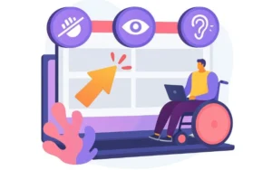
5. Not Catering To The Masses

A recent survey published by WHO states that there are about 1.6 billion people with disabilities. Visual impairment and hearing difficulties can affect the way a person views your website. While certain industries must have ADA compliance, we feel that everyone should make their website more accessible to the masses. Not only does this improve user experience, it builds a long term bond with customers who may have been indirectly denied service from a non compliant website.
We provide ADA compliant services. Feel free to discuss this further with us.
6. Poor Website Security

It is our responsibility to provide customers with adequate security on the website. Good security measures establish us as a responsible brand and build trust amongst customers. Web developers should automate website updates to effortlessly maintain security at all times.
Additionally, websites that deal with logins and payments should compulsorily have SSL certificates. Additional features like ‘Login via Google’ improve website security and protects sensitive information.
7. Bad Search
If website navigation is not on point the search icon can retain customers. A simple search will give customers what they are looking for. To provide an optimized search feature, web developers must constantly update the functionality with new search terms and keywords. The updates must consider typos and human search behaviors; there’s nothing worse than customers not finding what they are looking for because of a typo.
A search feature does require regular upkeep and many websites can do without it. So, think twice before adding one to your website because a poor search feature will do more harm than good. Bad search leads to bad user experience and if customers don’t get what they are looking for, they will simply go to your competitor.
8. Poor Colour Scheme

A balance of brand colors is crucial for a positive image. Just like the order and sequence of content, a disorganized display of color schemes can give you an unpolished appearance. Well thought out brands start with a brand profile that outlines its’ brand colors. Ideally, a brand should have primary colors, secondary colors, and complimentary colors with their hues laid out.
A good brand profile will save you the hassle of rectifying poor color schemes on a website. Make sure your brand color scheme is a collaborative effort from your brand manager and designer. Their input will build a brand identity that strikes a balance between creativity and professionalism.
9. Poor Use of CTA
Call to action or CTA is the soul of our website. It is the reason why we build a website. After all, what is the point of it if we don’t give customers the chance to communicate with us? So naturally, if a CTA is not designed properly, poorly placed on the website, or worse, not placed at all – it will hinder your conversion rate.
Well-designed CTAs that are placed properly and have a clear message will increase long-term customers. Make sure your CTAs match your brand color scheme and are mobile responsive. Check out our article on The Art of Creating Engaging and Effective Call to Action buttons to know more.
10. Unoptimized 404 Error Pages

When a customer clicks on a page that cannot be found, they will get a 404 error page. Many web designers forget that this page can be customized as well. You can redirect customers when they enter a non-existent link. Sometimes companies temporarily take down their site to make developmental changes. This is an excellent opportunity for brands to use their 404 error page with personalized content and contact information.
11. Poor Use of Analytics and Heatmaps

You can have the best website possible, but if you don’t make use of analytics and heatmaps, you will fall behind the competition. Analytics and heatmaps show us how our customers are behaving. A quick look at your heatmaps and you will get an idea of what your customers like and dislike the most about your website.
Your web design service provider should install heatmaps and analytics on your website. Timely auditing and analysis will help them build a more optimized website.
12. Slow Website
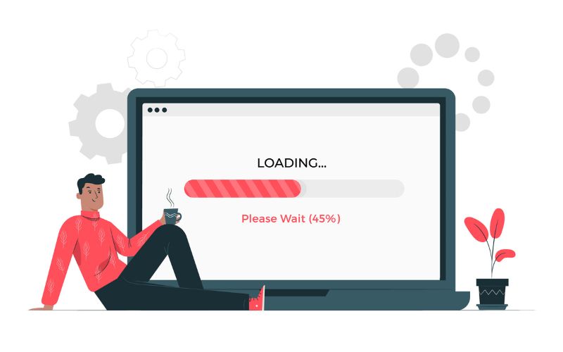
We see this often where companies may have a fast desktop website version but the mobile version is much slower than the recommended loading time. Since most visitors use their mobile devices to browse your website, this hinders their ability to use it.
Currently, an average user expects a website to load within 3 seconds so if your website is not up to the mark, you should look into the following:
- Do you have unnecessary plugins and extensions on your website? If yes, you should remove them.
- Are your media files too heavy? You can either compress them or use an external link.
13. Overuse Of Features and Plugins
Now with the last point, we want to re-iterate what we mentioned in our first point. Too many features and plugins reflect a lack of direction. It not only confuses your audience but slows down your website causing UX to drop significantly.
You must plan your website and prevent the overuse of existing plugins. A good web developer uses modern coding techniques and can build lighter versions of some extensions – customizing them for your website. When good planning meets excellent developers and designers, you have magic!
Conclusion
So here are 13 of the most common mistakes to avoid when designing your website. Your website is the face of your brand, you must handle it with care. Netlynx provides web design and development services. In fact we have a checklist that we frequently update, making sure that none of these mistakes are present in your website. Get in touch with us to know how we can help you.