As more customers find companies by browsing search engines on mobile, having a mobile first website can make or break your business. If you have a fast, efficient and user friendly mobile design, customers are likely to feel valued by your brand. So here’s everything you need to know about having a mobile first web design.
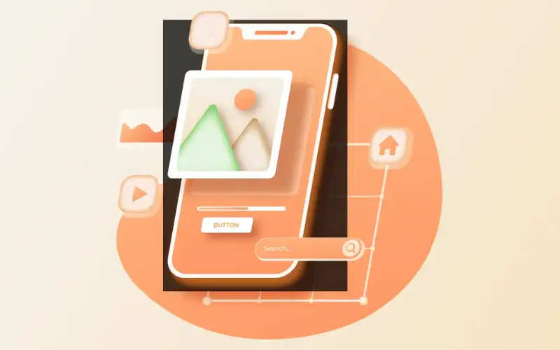
What Is Mobile First Website Design?

As the term suggests, a mobile-first website design aims to design a website for smaller screens first, identifying all the design elements and challenges that come with a smaller screen, and using that as a guideline for bigger screens. It allows you to let go of certain design elements like CSS hover animation or adding micro animations to buttons and images.
Some website designers argue the mobile version of a website is the most challenging of all the screen sizes. This is because you must maintain website speed and retain the most important elements of your website while keeping your visitors interested.
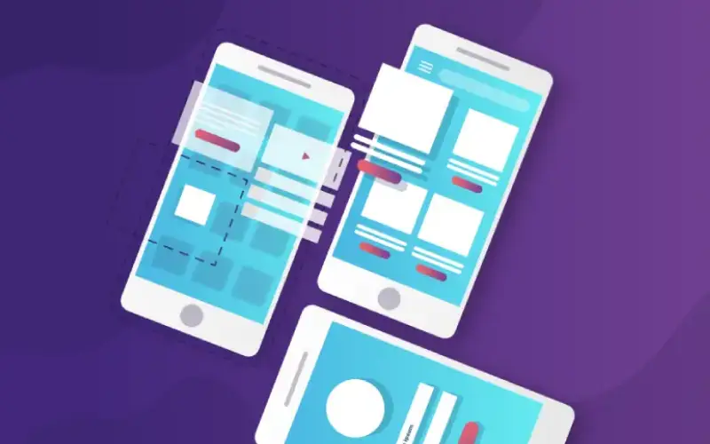
The opposite of the mobile-first design method is the graceful degradation method. We see graceful degradation used even today where experienced website designers focus on the merits and challenges of designing a website from the start and later strip away the complexities into a bare-bone structure for the mobile version. The only problem with this design method is that the mobile version is not at the center of the design initiative and is rather created as an afterthought.
A decade ago, it was acceptable to create a mobile version as an afterthought but today, when 80% of our potential customers are coming from mobile phones, mobile designs need to be at the centre of our web design strategy.
Here Are 7 Tips To Creating A Mobile First Website
The mobile first approach needs a bit of practice and cannot be handled by novice designers. In this article we will provide you with a mobile first design cheat sheet that you can use as a check list to assess your website’s mobile version.
1. Customer-Centric Design

Why should someone browse through your website? Knowing this can simplify the entire mobile development process. A customer-centric design puts the customer’s needs above everything else. So if a customer wants to buy a particular product, that product should be the first thing they see, or if they are looking for a piece of information, they should not have to search for it to find it on your page. Experienced web designers start by creating a buyer persona and building the website from there.
2. Content First Design

Similar to the above pointer, designers need to make sure that the main content – the reason why someone is coming to your website – should be the focus of your website. Mobile phones have a smaller screen real estate, so we can let go of certain hero images that do nothing other than slow down the website.
Written content makes a massive impact on creating a mobile first design. If your content is crisp and under the spotlight you are more likely to grab your audience’s attention.
Font size, color, and typography also add to the readability of your design. Choose a font that is easy to read, properly spaced, and has good contrast. The last thing we want to do is to ruin the customer experience with a hard to read font!
3. Intuitive Navigation

Navigation should come naturally to customers. You may have noticed how many mobile versions of a website have a hamburger drop-down menu. This allows for efficient use of the mobile screen. The placement of navigation icons is very important for customer satisfaction. Customers prefer mobile websites that they can navigate with a single hand.
Hence good websites provide all the important navigation icons and capabilities on the bottom or mid part of the page (like the option to chat with a representative and scroll the page) and they provide the lesser important navigations on the top of the website (like going to a different page and moving away from the call to action).
Make sure your navigation icons follow the natural pattern of a customer’s mobile screen habits and this will increase your chances of building a strong relationship with your customers.
4. Avoid Pop-Ups

While pop-ups can drive user action, it is best avoided for mobile versions. Unlike a laptop or desktop, you cannot have exit-intent popups that are designed to track the movement of the cursor. Mobile pop-ups are either stationary or prompted by the scroll action. In both cases, it takes up a lot of screen real estate and, if not designed properly, can impede the customer’s experience.
Hence for a top-notch mobile experience, it is best to keep pop-ups at the bare minimum. Instead of pop ups, you can focus more on providing to the point content and media that encourages customers to take action.
5. Building Visual Hierarchy

What is the most important takeaway from your web page? This is the most crucial information for building a visual hierarchy. At the end of the day, we want customers to take action on our website. Having a visual hierarchy puts a direct focus on the content that is most important to your brand and clients.
You can create a visual hierarchy through a few simple steps, like:
- Ensuring the titles are on top
- Large chunks of content are easy to read and broken down into pointers or one liners
- All photos, videos, and animations are re-sized for the mobile
- There is good spacing between your content so that your website elements don’t overlap with one another
- Important content is on top
- CTAs are positioned in the lower and middle part of the website where it is easily accessible by single hand mobile users
6. Enlarge Clickable Buttons

The size and placement of the button are very important for long term success. Do not shy away from having a slightly larger button. Mobile visitors are usually browsing a website when they are on the go. Hence making the button easy to find and use, makes it easier for customers to take action on the website.
7. Loading Speed

Lastly, we cannot emphasize how important loading speed is for your online success. It may in fact be the single most important factor that drives online success yet it is the one thing new businesses and developers fail to consider.
Since mobile users can browse both via wifi and data, what was fast on a desktop may slow down immensely on mobile.
You can improve loading speed by:
- Cutting out unnecessary animations, fluff, and media from the mobile version
- If you have YouTube videos and images, make sure you provide them in a smaller size dimension
- Only add videos and images if it is absolutely necessary for your website. Too many media elements can slow down your website
- Reduce the number of external loaders on the page – like Cookies and YouTube videos
Conclusion
So here are our 7 important tips on creating the perfect mobile first website. Just a few small adjustments can make a massive impact on the way someone views your brand. Hiring an experienced web designer and developer can speed up many of these processes, making sure that you put your best foot forward in the online world. If you want to work with a professional web design agency, Netlynx Inc. has got your back. Feel free to give us a call and tell us what you are looking for.

