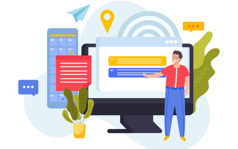
Statistics have shown that CTAs have a massive impact on conversions. In fact, you can increase your conversion rate by 42% by just making your CTA look like a button. It’s a small yet vital criterion many companies forget to include on their website. Currently, around 70% of websites run by small B2B companies don’t have a CTA! This gives you good reason to hop on the bandwagon today and be the 30%!
With our tips on the art of creating effective call to action buttons, you will notice a shift in your audience behavior in a matter of months.
Understanding User Psychology
What makes a CTA effective? For that, we need to understand user psychology. Why is a user on your website and how are they using the website? Here are certain human psychology aspects you should keep on your mind:
1. Emotions and Urgency

Did you ever buy a product, or join program/app because all your friends are doing it? FOMO is real and companies are monetizing it! If you have social proof and can strike an emotional chord with your customers, your CTAs are far more likely to work.
2. Clear Messaging
Customers are likely to click on a button when they know what is on the other side. This is why a precise CTA like ‘Get Your Free Plan’ is far more likely to work than ‘Know More’.
3. Language Simplicity

Unless it is a part of your brand image, you must reduce cognitive load wherever possible. This is why CTA buttons that have a simple instruction like ‘Learn More’, ‘Download Now’ are far more effective than say ‘Survey Now’ or ‘Peruse Through’.
4. Customized Buttons
Although it’s not possible everywhere; personalized CTA messages can make a customer feel special, thereby increasing their chances of taking action. For instance, the CTA ‘Join Our Clan’ is much more effective for a group of gamers than ‘Join Our Group’,
7 Things To Consider For Effective CTAs
To improve your conversion rate, you should understand the importance of each of the elements mentioned below.
1. Color Psychology

Color plays a massive role in the way a customer perceives your brand. Have you ever noticed how food brands (especially fast food brands) use a lot of red? Why? Because red creates a sense of urgency. Red buttons encourage us to take action quickly. Whereas a lot of financial and B2B brands will use lighter shades of blue. Blue communicates trust, hence a blue button implies that you go onto the next step feeling safe.
2. Button Position
Where you position your button affects the urgency of the CTA. A good website design agency will always keep 1 CTA above the fold because data shows it’s where maximum users take action. But of course that’s not the only place for a CTA.
Always be mindful of the gap between your message and the CTA. The space in between should not be too much that the user forgets to take action, and it should not be so little that it overwhelms the user.
As we know, humans are emotional beings, and positioning the CTA right below testimonials, and vivid imagery that strikes an emotional chord will improve the chances of conversion.
3. Clear Text
Customers should know what they will receive once they click the button. Buttons like ‘Know More’, ‘Learn More’, ‘Download Now’ etc do work, but if you can be a little more specific, your chances of conversions increase greatly.
For example, in one of their sections, Mailchimp chooses to be more specific. Instead of saying ‘Explore Now’ they say ‘Explore 300+ Integration’. This gives customers the incentive to investigate further.
4. Design and Contrast
For a CTA to work, it needs to have some contrast from the rest of the page. As mentioned above, 42% of customers respond to a CTA when it looks like a button and around 26% more people respond to a button if it is supported with an arrow.
5. Order Of Importance
Good web design dictates the power of importance. This means that an experienced web designer can control the parts of the website that get maximum attention. They do this with sizing elements and color contrast.
A good website design agency will start the process by outlining the most important to the least important elements of your website. This will help designers position your CTA buttons in places where customers are more likely to take action without overwhelming the readers.
6. Scanning Patterns
Customers browse through websites in a distinct pattern. It is called the F pattern and the Z pattern. For your CTA to be most effective, it needs to be in the path of the natural reading habits of your customers, causing them to put in the least amount of effort to find your CTA.
7. Review. Reflect. Repeat.

Of course, every group of audience is unique. Despite what the consensus says, you must install heatmaps on your website to get a personalized reading on your customer behavior. Heatmaps tell you what potential customers are reading the most and what is making them leave.
Strategically placing CTAs in places that have proven to grab maximum attention, will increase your chances of customer retention.
CTA Don’ts: Here Are 2 Things You Should Steer Clear From
1. If you highlight everything you highlight nothing
This point further elaborates on point 3. Treat it more as a disclaimer than a contradiction. There is a reason why CTAs like ‘Know More’, ‘Download Now’ is used so often – it is because they are familiar to our visitors and reduce the cognitive load making it easy for customers to take action.
Hence your CTAs should have a healthy balance of familiar terms and an occasional unique CTA. For example, Tiffany & Co uses a unique CTA in only one section of their homepage – ‘Follow Your Diamond Journey’. In other places, they use CTAs like ‘explore’, ‘shop’ and ‘learn more’.
2. Do Not Condescend Your Users
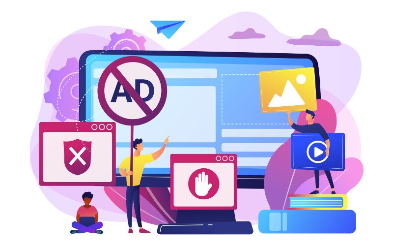
A few years back, it was a common trend for companies to have a cheeky comment on the button they didn’t want customers to click on. For instance, YouTube did this briefly when they launched their ads-free program. On their ad, 1 of their button said ‘Go Ads Free’ and the other said ‘I Want Ads’.
Customers don’t want ads, they click on the button because they want to decline your offer. While it was believed for a few years that a cheeky or patronizing comment like that will deter customers from choosing the undesirable option, and force them to ‘go ads free’ or ‘subscribe to a newsletter’, etc. But netizens are getting smarter, they know how to say ‘no’ to companies and having tricky buttons like that not only cause poor customer experience, they distance customers from your brand.
This is why, your number one priority should be to make every CTA easy to understand and respectful so that all your visitors (customers or non customers) can use your website without feeling patronized.
Conclusion
We hope you found this article helpful. CTAs may seem like a small addition to your website but they indeed make a massive impact. If you need to improve your existing CTAs or provide more CTAs to your customers, you can contact Netlync Inc. We are a website development and web design company with 12+ years of experience. We can help you design a website that ticks all the boxes of good CTA design.