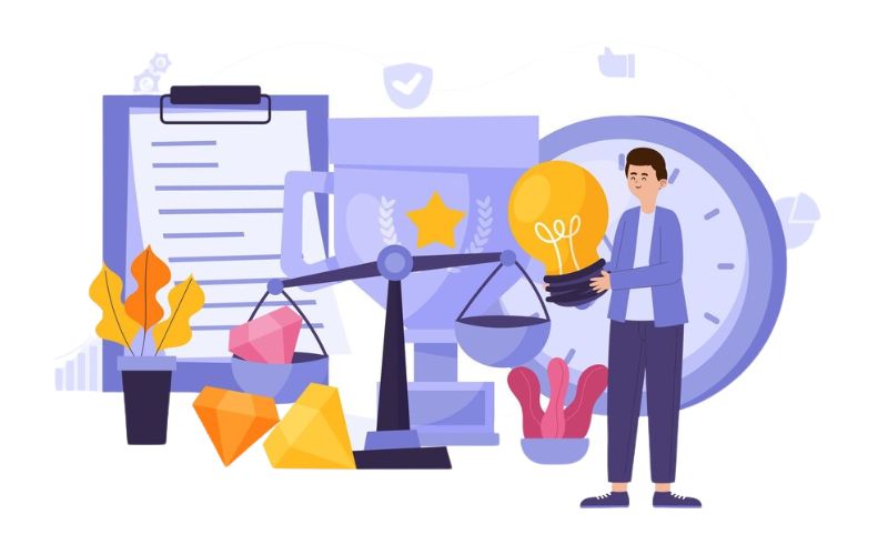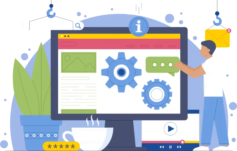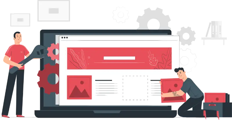
It has become an important marketing tool for every organization. As businesses have evolved from an offline to an online presence, a simple online presence is no longer sufficient. A Website Redesign ensures that your site reflects the modern face of your business and keeps up with the fast-changing digital landscape. To be in the same race as other competitors, your website must reflect modern and realistic trends, hear what a user expects, and function smoothly. Sometimes it takes a backward step to move forward through redesigning a website.
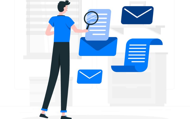
However, if at all, when is the ideal time to do so, and why is it important? Let us explore some of the most important reasons as well as the signs that indeed warrant the need for redesigning your small business website, so you know how a professional web design company, offers both web design services and website development services, If you don’t know about it, please read the blog completely and find out.
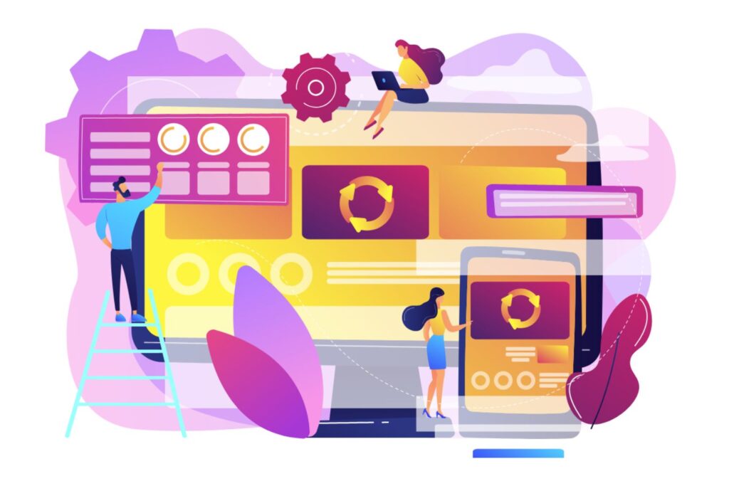
When Should You Consider a Website Redesign?
When you know the exact time to redo your site, you are likely to be keeping away from losing customers, damaging your brand reputation, or even getting out of touch with your competitors. Here are some telltale signs:
1. Your Website Looks Outdated
With new trends in web designing cropping up almost daily, something that seemed so trendy about five years ago could look so backdated and unattractive today. A lot of people judge this form of business by the basic look of the website and a poorly designed website would create an image that the business is rather outdated. Redesigning the website keeps the website updated with the latest trends and, hence, improves brand value. As a skilled website development service provider like us, we design your website better and futuristic.
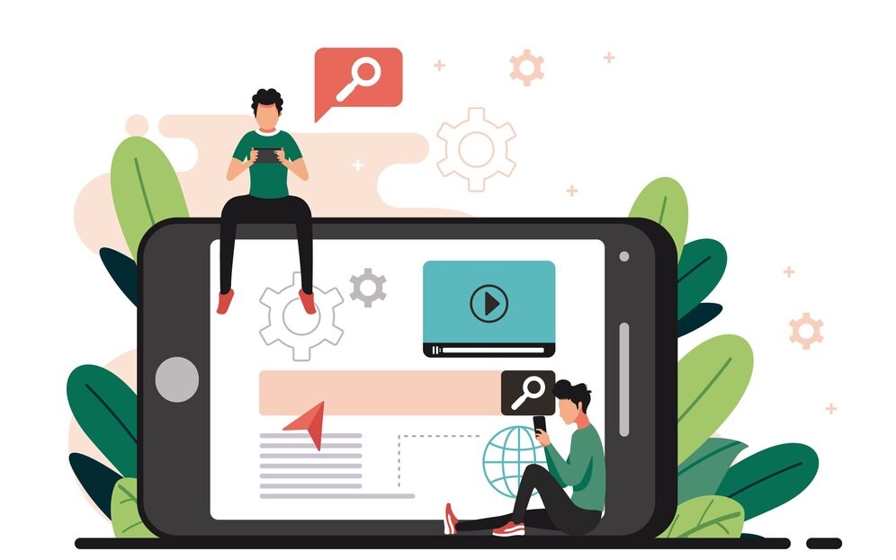
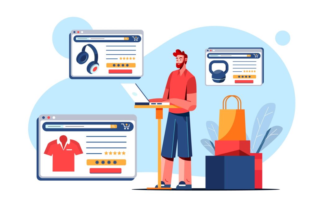
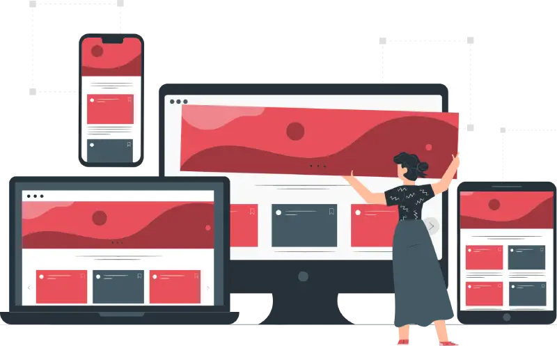
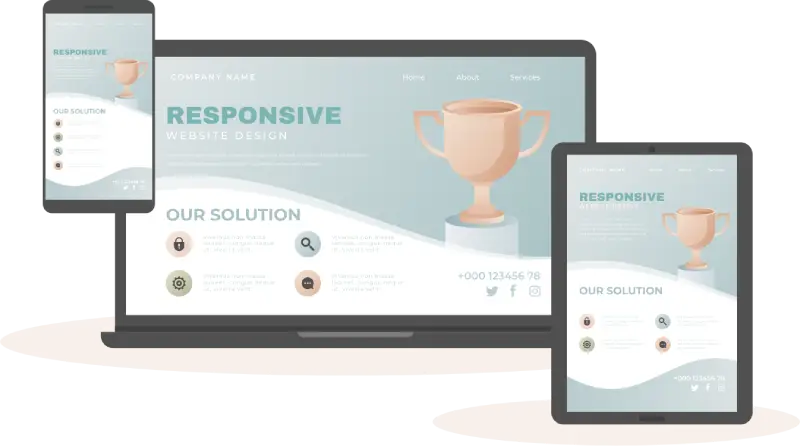
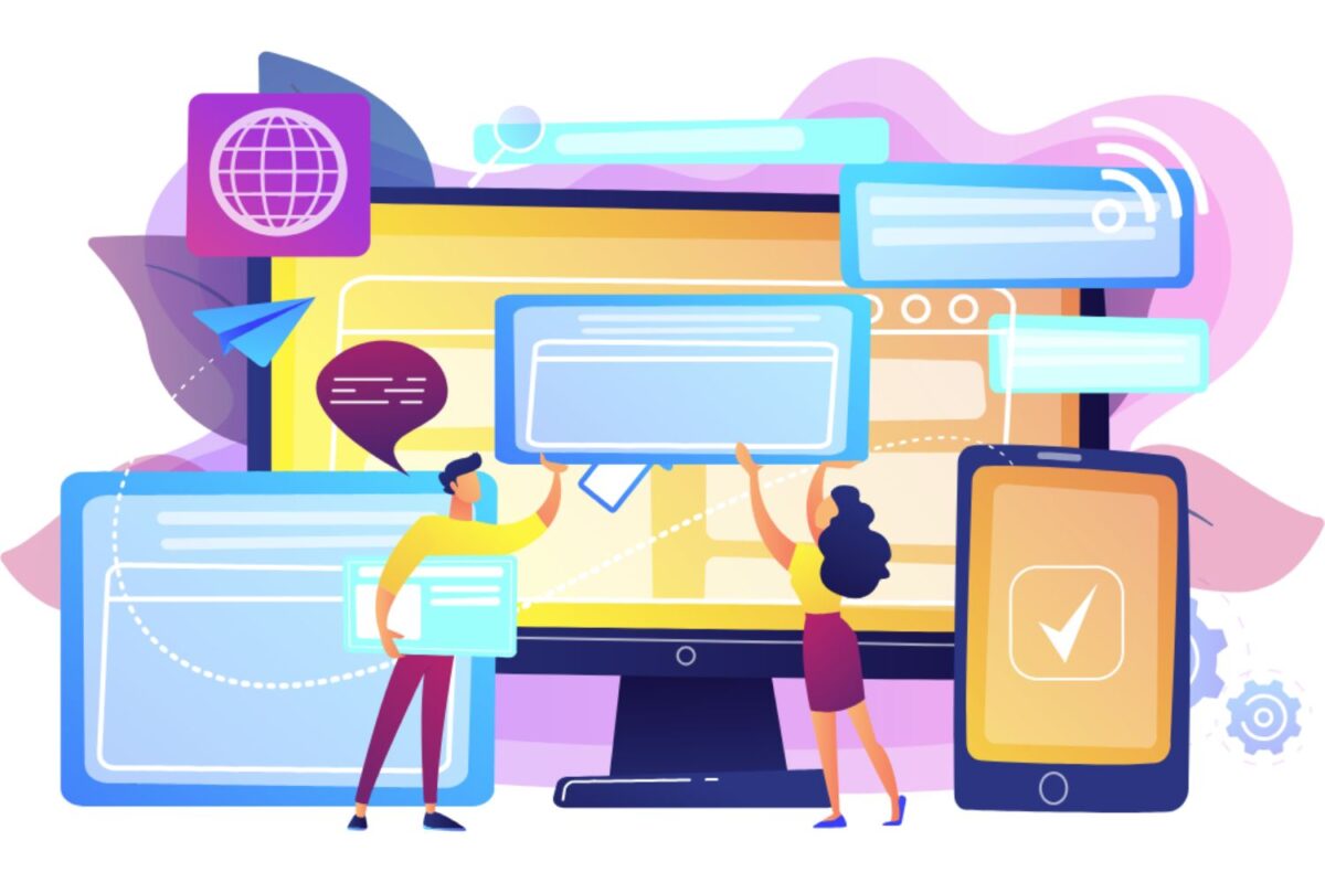
2. Your Website Doesn’t Adapt to Mobile
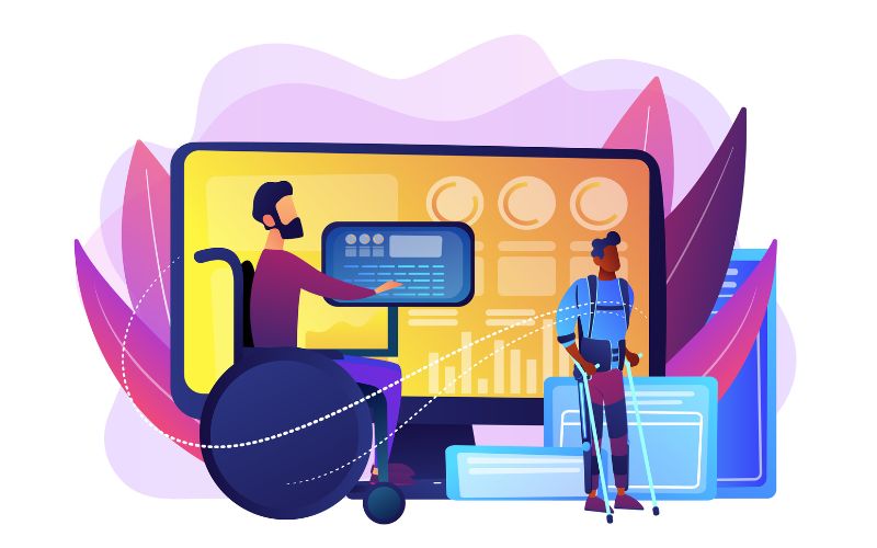
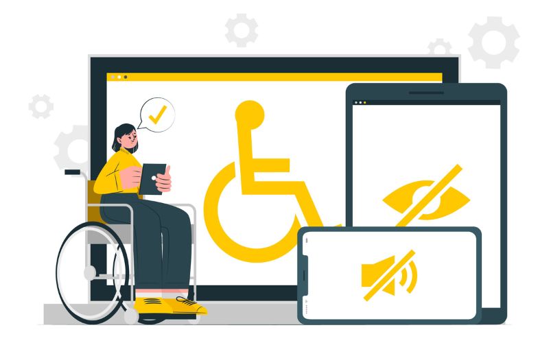
More than half of the world’s traffic comes from a mobile device rather than a desktop computer when it comes to browsing websites. Your website must respond to that kind of traffic, and if it is unresponsive to little screens, then it needs to be redesigned by applying a responsive design.
3. Bad User Experience (UX)
You know your site needs redesigns when the following symptoms can be seen: slow page loads, navigation issues, or indelicate or misleading content factors which will see your users finding solace in your competitors’ offers. A good design translates to a complete rethink of how the site offers accessibility, loading speed, and general usability.
4. Low Conversion Rates
Is your site getting a good number of visitors, but the conversions never seem to match that figure? It shows that the CTAs are ineffective, the layout is poor, or the content is confusing. Well, redesigning the site might just be what it takes to optimize the whole structure and CTAs for action.
5. Rebranding and Expansion of the Business
When the brand identity changes or the business expands, the website needs to reflect these brand changes. The redesign will benefit you in updating the look, message, and various functionalities to meet your new objectives.
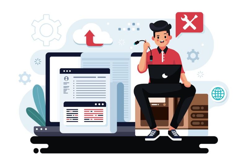
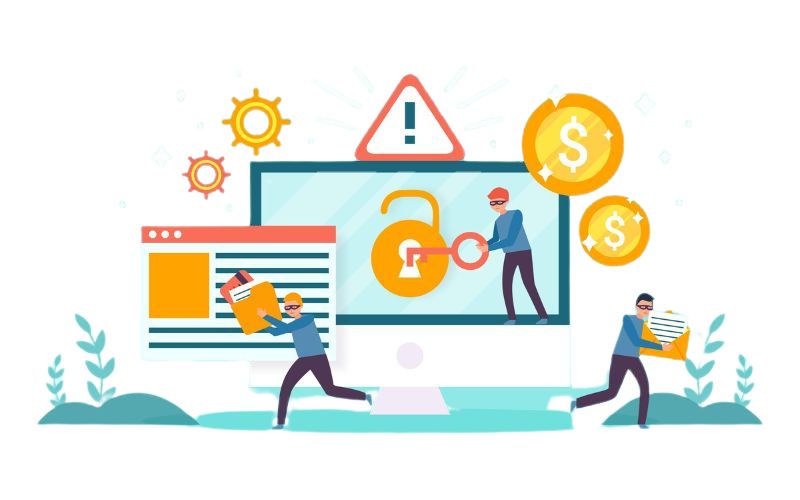
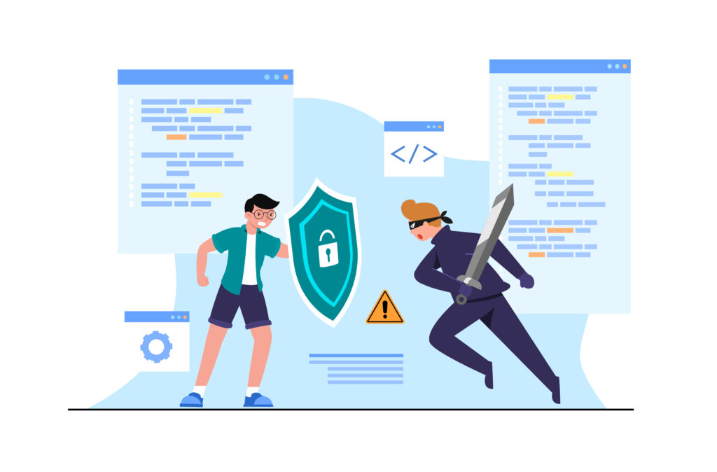
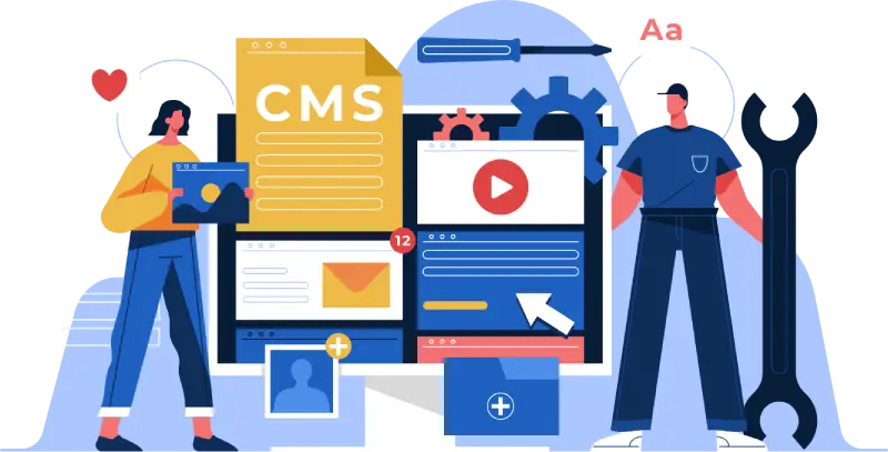
6. Old Technology
You will find that it is practically impossible to use any outdated content management system (CMS) or old plugins. You need to modernize your website with the help of expert web design services. Management of this site will become easy, and security measures will be enhanced as they become more robust.
Why Is a Website Redesign Important?
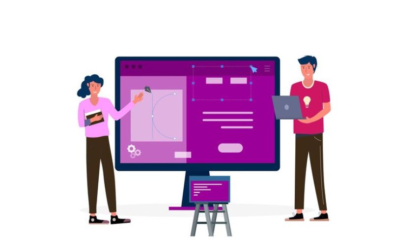
Revamping your website, not just on the outside but to intrude upon a real business investment, do the following:
1. More engagement-related user interaction.
New and handsome websites dare surfers to go in and get lost in its contents. By all means, a website should have an intuitive design in navigation and visually appealing to keep them longer on the website, thus increasing the possibility of increased brand credibility.
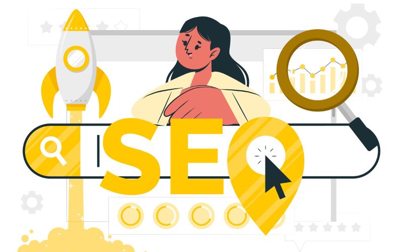
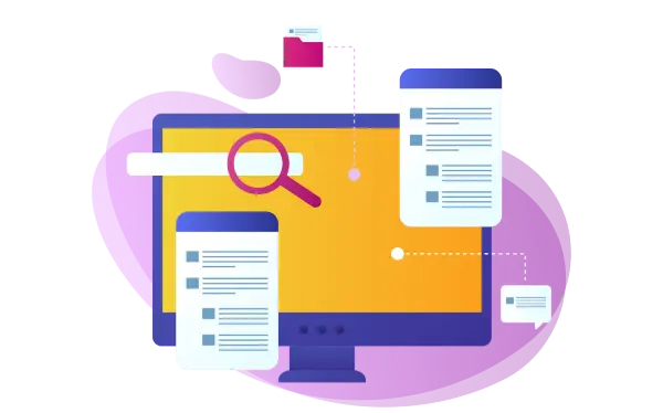
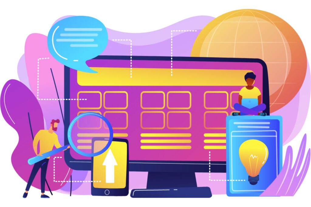
2. Better SEO
Quality is paramount in any site intimately loaded with digitized earthly materials. A design that suits users and improves speed, including mobile friendliness, is pertinent in the redesign since all search engines value this. It would greatly improve your search engine ranks, thereby generating organic visitors to your site.
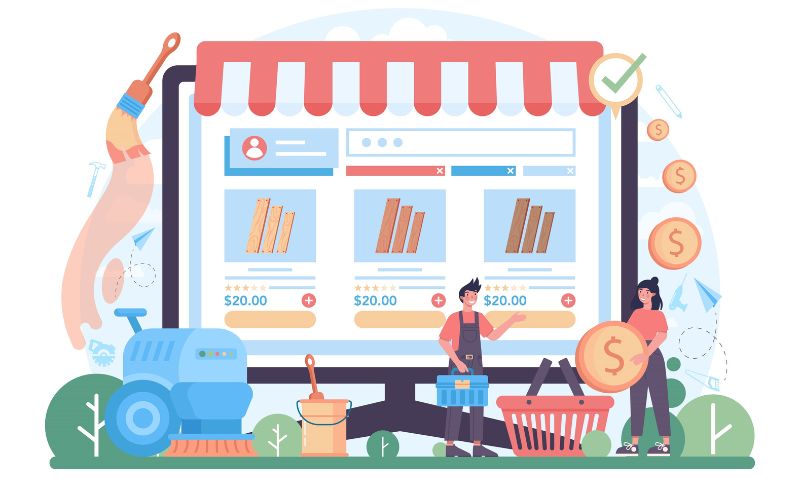
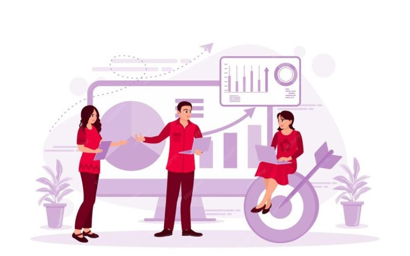
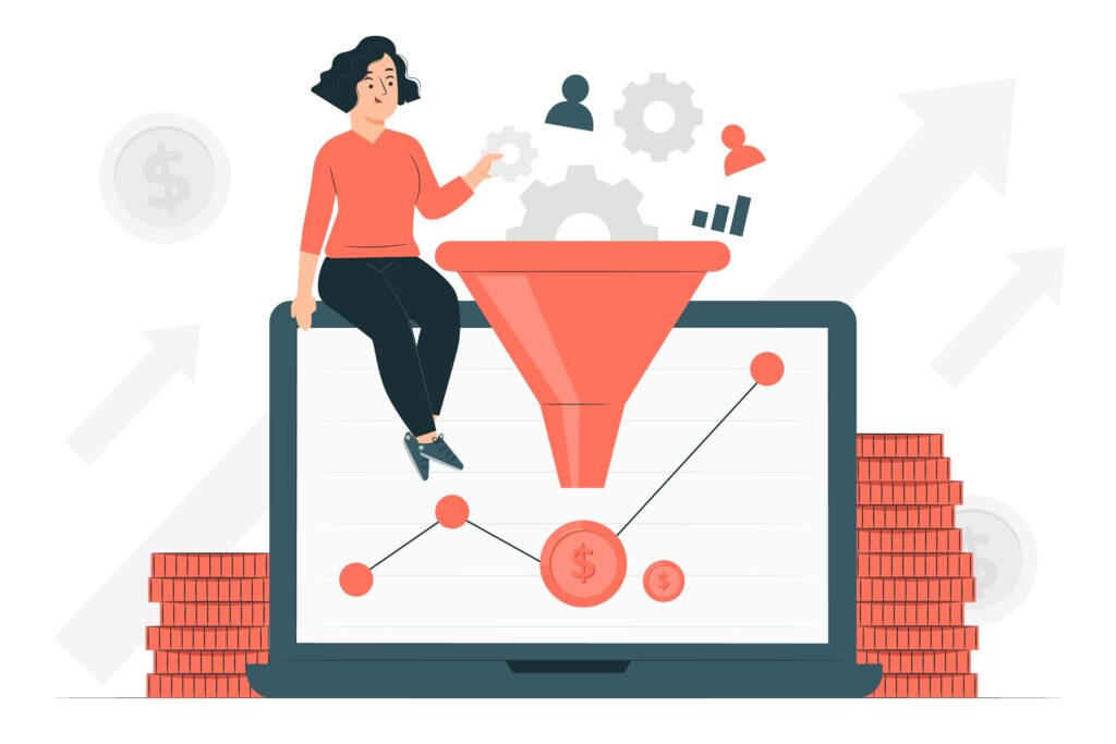
3. Higher Conversion Rates
A purposeful website design guides visitors toward making the entrepreneurial actions either to put their name on the subscribers list or buy something online. It has a clear call to action, an optimized layout, and spectacular content, and all this would turn visitors into lifelong customers through a redesign.
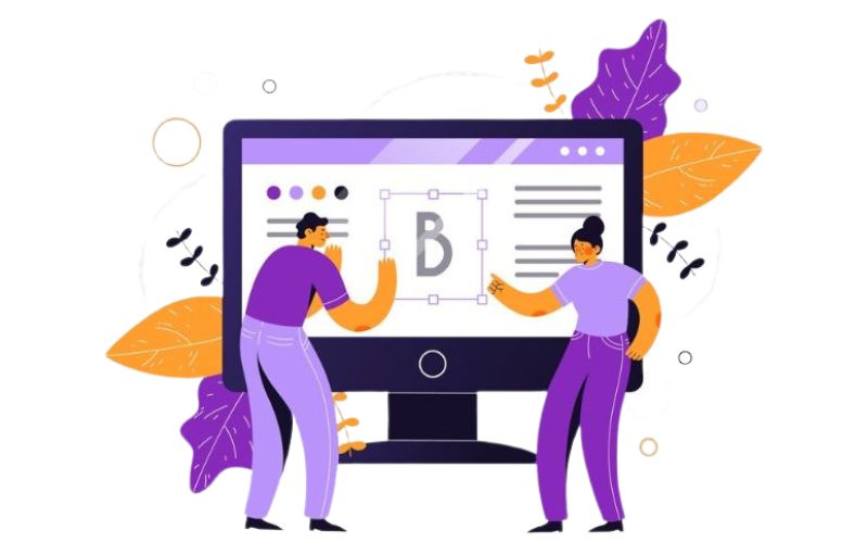
4. That Capture Your Brand Identity

It’s about time a turn takes place in redesigning your website. Your site is one most critical brand touchpoints. It accurately reflects the company’s current values, mission, and offerings. This lends credibility to the business in its audience’s views.
5. Stand on Competitive Advantage
Your site could be outdated and then have a very competitive offering at that. The redesign will keep your site up to date with recent trends and technologies, which will prove your business to be incorporating modern ideas and leaving your competitors further behind.
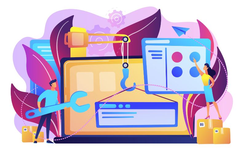
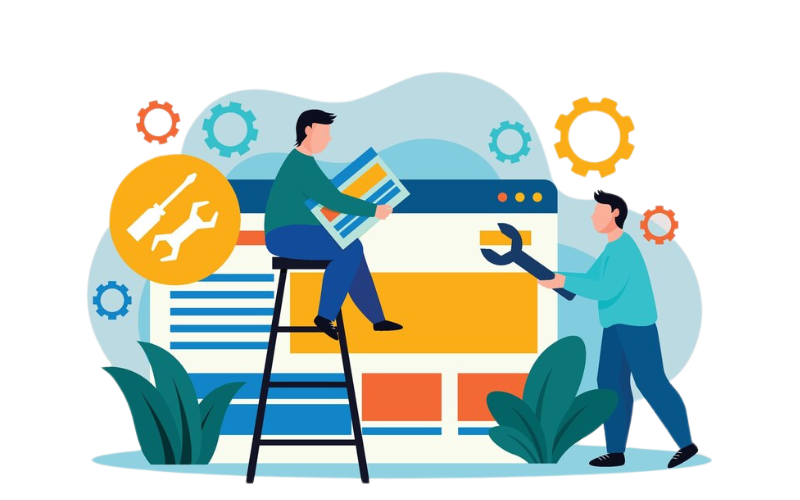
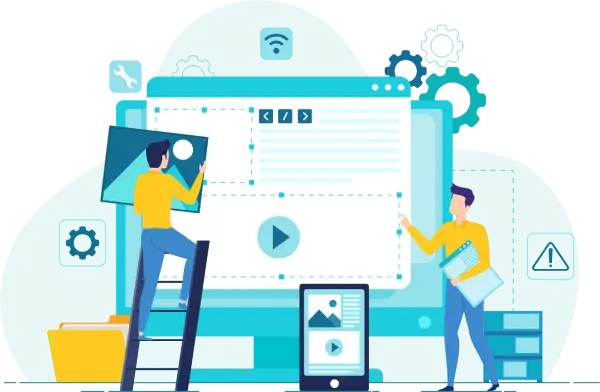
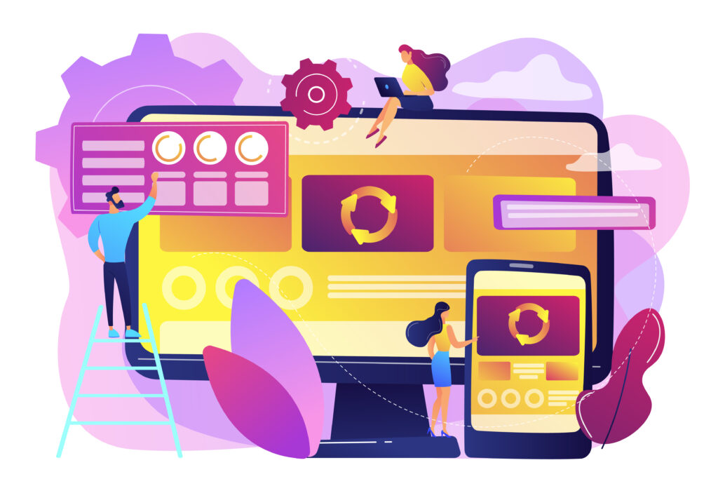
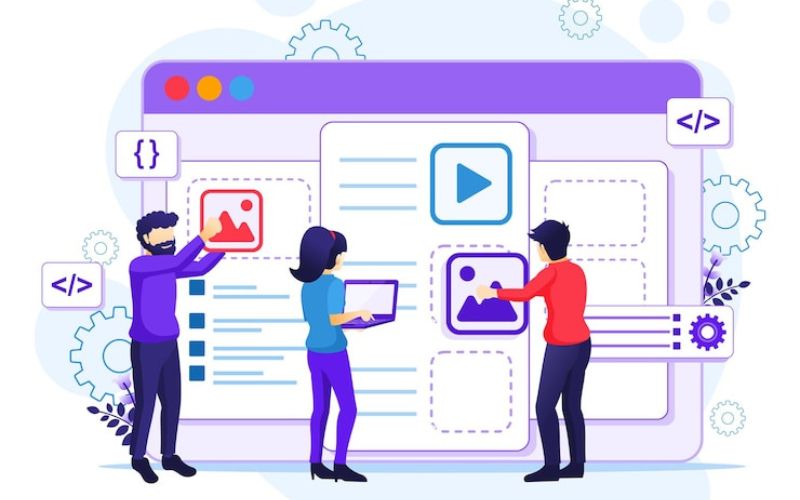
How to Approach a Website Redesign
It is a critical procedure which needs detailed research and careful implementation for redesigning your website. The way to approach it includes.
1. Define Your Goals
The first point is to define what you would like to see in the redesigned site: is it the user experience, performance in SEO, or the reflection of the rebranding activity? By setting clear goals, the entire process is directed.
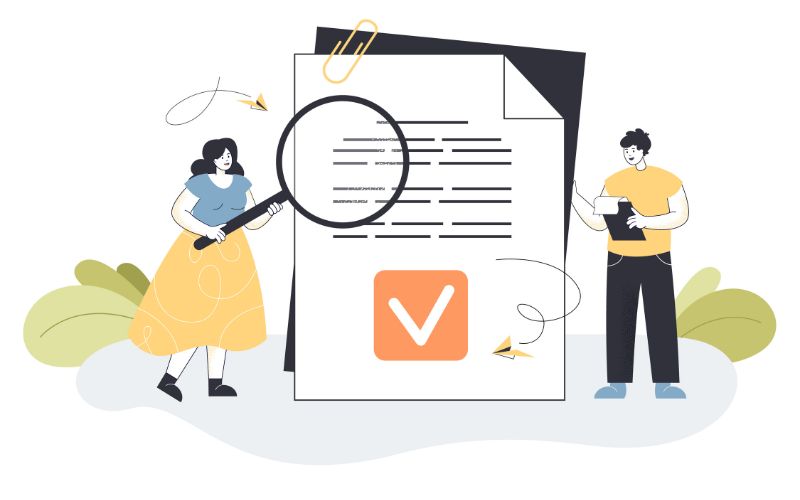
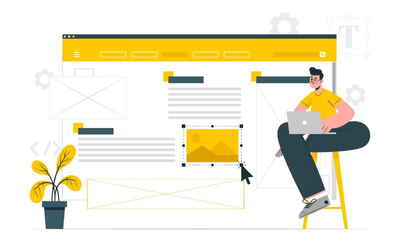
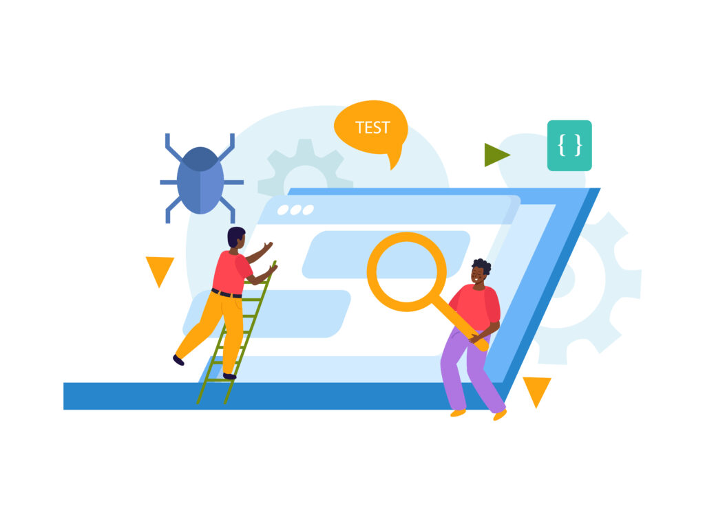
2. Analyze Your Existing Website
A complete penetration audit of your existing site. Find out what works in terms of utility and what is not working. Consider feedback from users as well as analytical data on potential competitors to benchmark these areas.
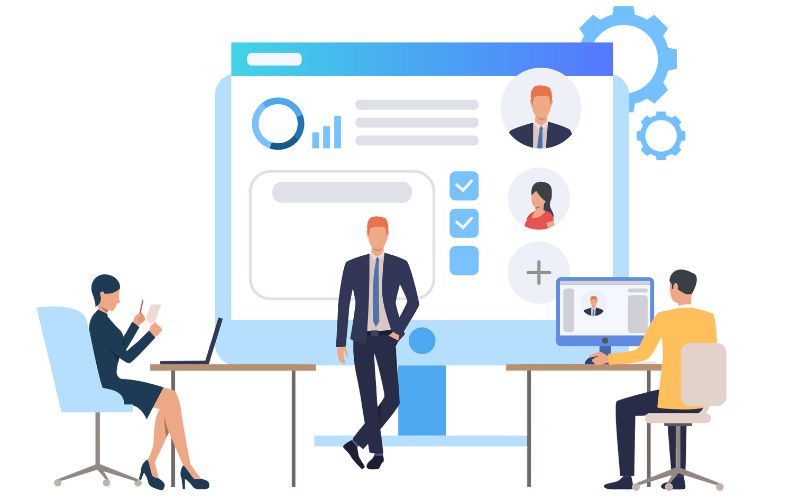
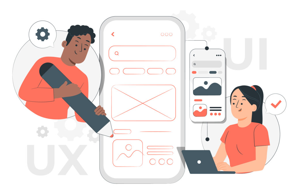
3. Partner with Experts in Web Design

By this, you will get smooth and successful redesigning processes. Because of this, the experts in web design agency will provide excellent web design and website development services, giving the right form and functionality in, above all, modern strength aligned with the necessities of your business.
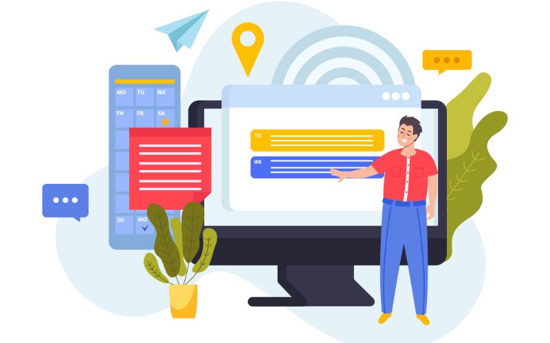
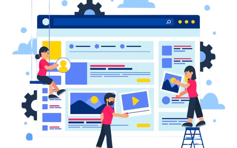
4. Make User-Centric Design
For example, in relation to contemporary design, the consideration of audience friends should undergo thorough changes. On the other hand, site visitors should find their way around the site with great ease and appeal when it comes to scraping the new design with optimized conversion.
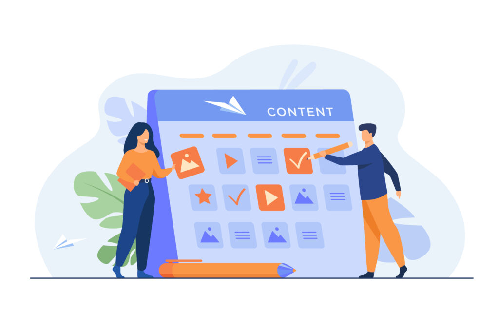
5. Integrate Best SEO Practices
SEO should be one of the elements involved in the process of your redesign. Speed of a page, use of mobile-first design, and keywords throughout content along with meta tags should be included.
Conclusion
Renewing your website provides an opportunity to enhance your online presence, engage one’s users, and grow your business. Whether our website is outdated, has low conversions, or no longer fits well with the brand, redesigning has become the first step toward success. Joining a trusted web design company like Netlynx makes the journey from strategy to execution as smooth as possible. With our expert web design services and website development services, we create a web-based environment in which one can develop an incredibly beautiful, but more importantly, measurable result-oriented site. Aren’t you ready to give your website a new look? Get in touch with us today to take the first step toward your better digital future!